3K Users to 6 Lakh
Bharat RTO a journey from
My Role:
Lead Product Designer
Timeline:
3 Months
Company:
Cars24
Collaborated with:
Product Owner, Product manager, Developers, Marketing Team, Founders

Imagine boosting

Active users by
200x

Retention by over
5x

Session time by
3x
🔥
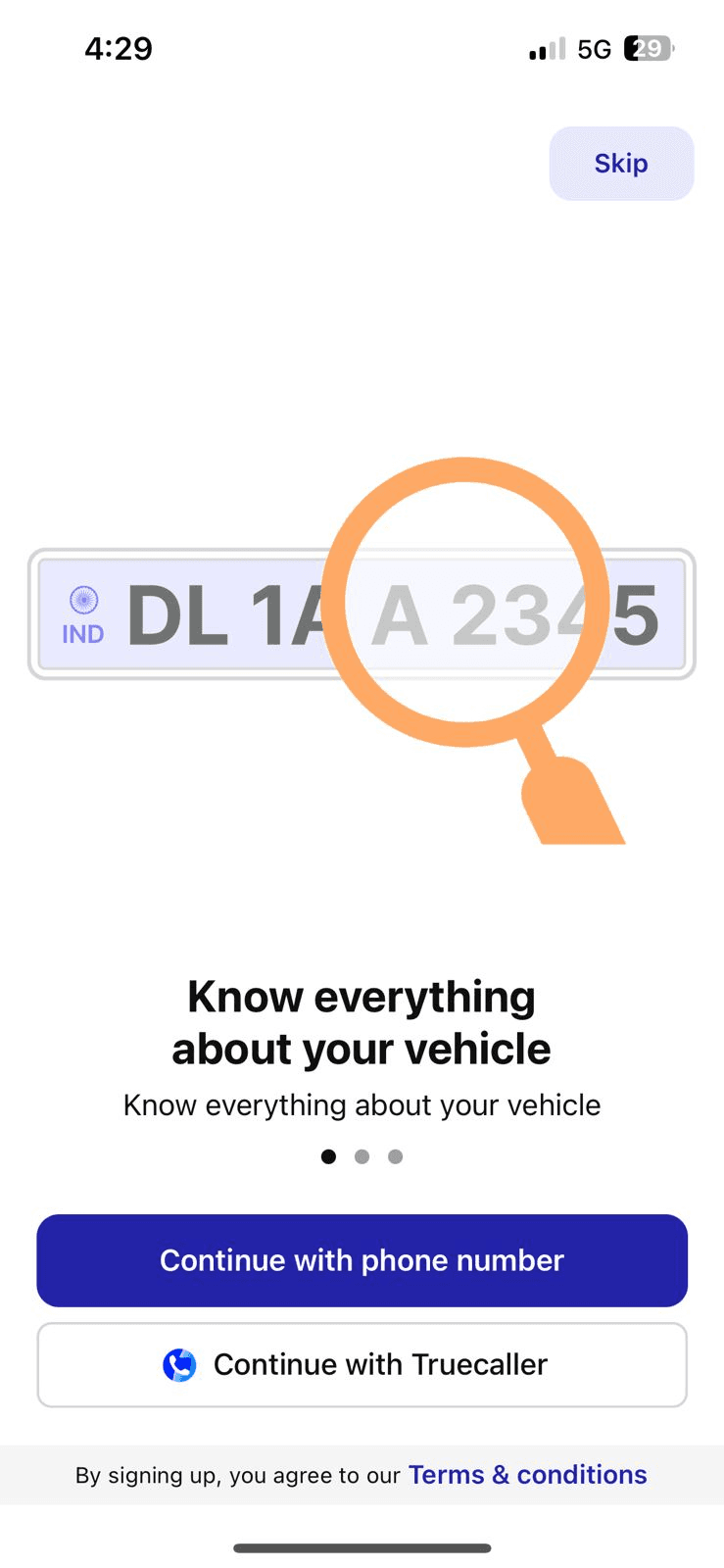
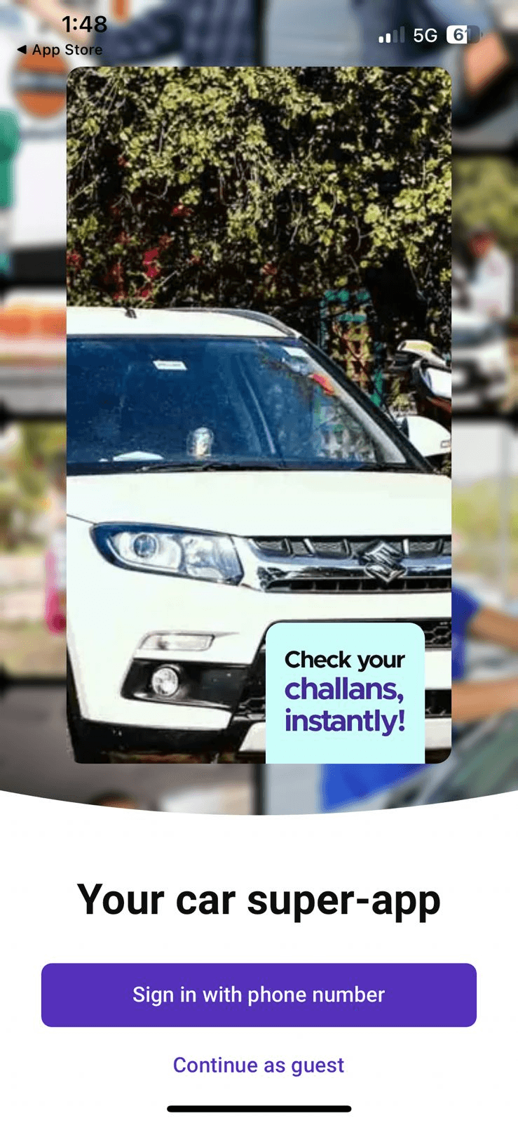
Yes, this is what we did for Bharat RTO vehicle management app within 3 months.
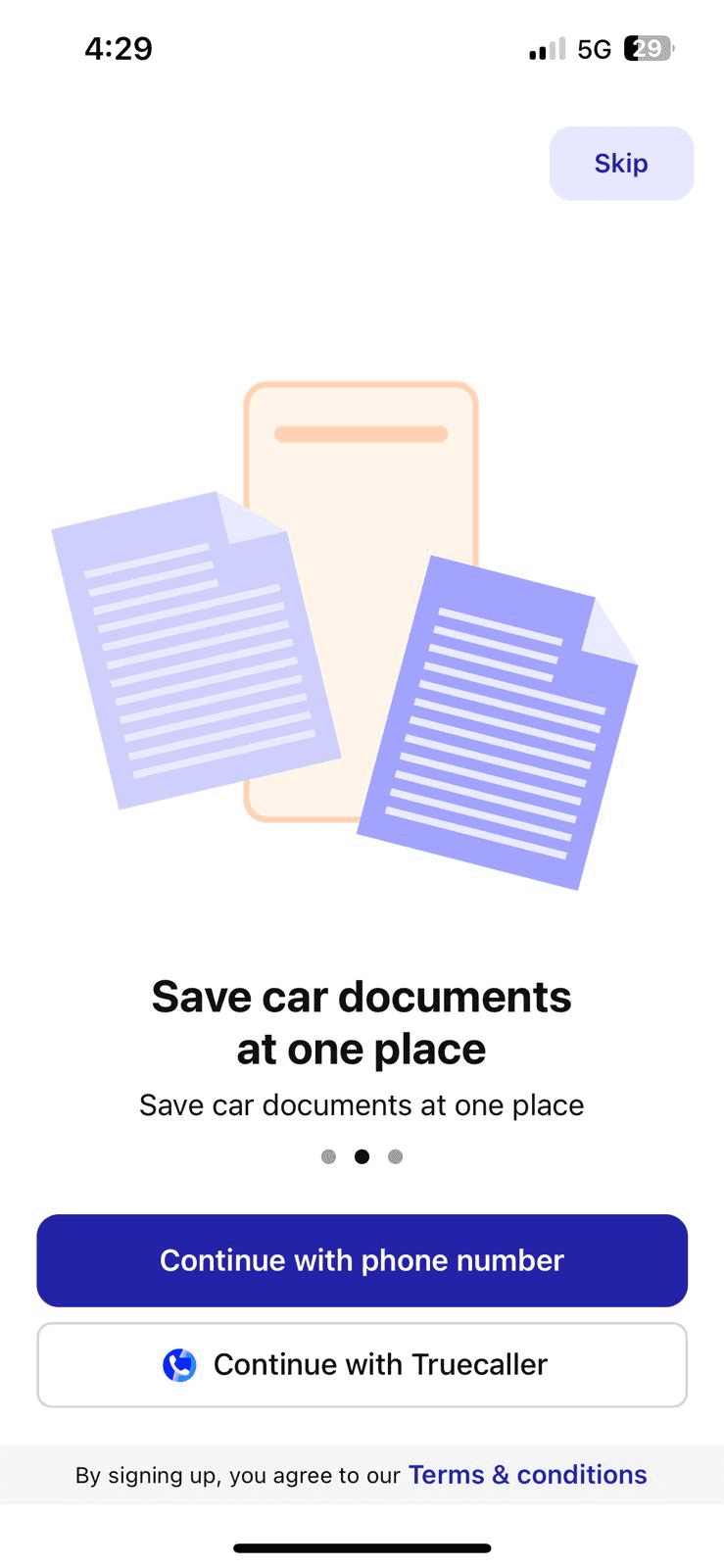
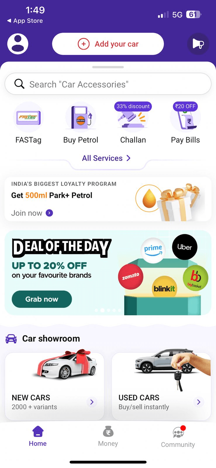
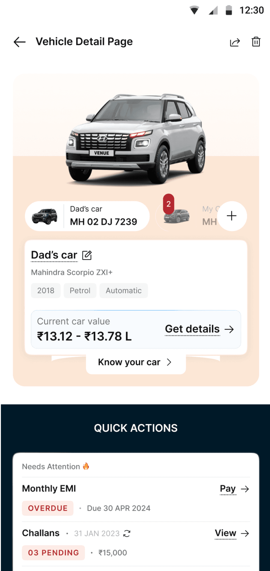
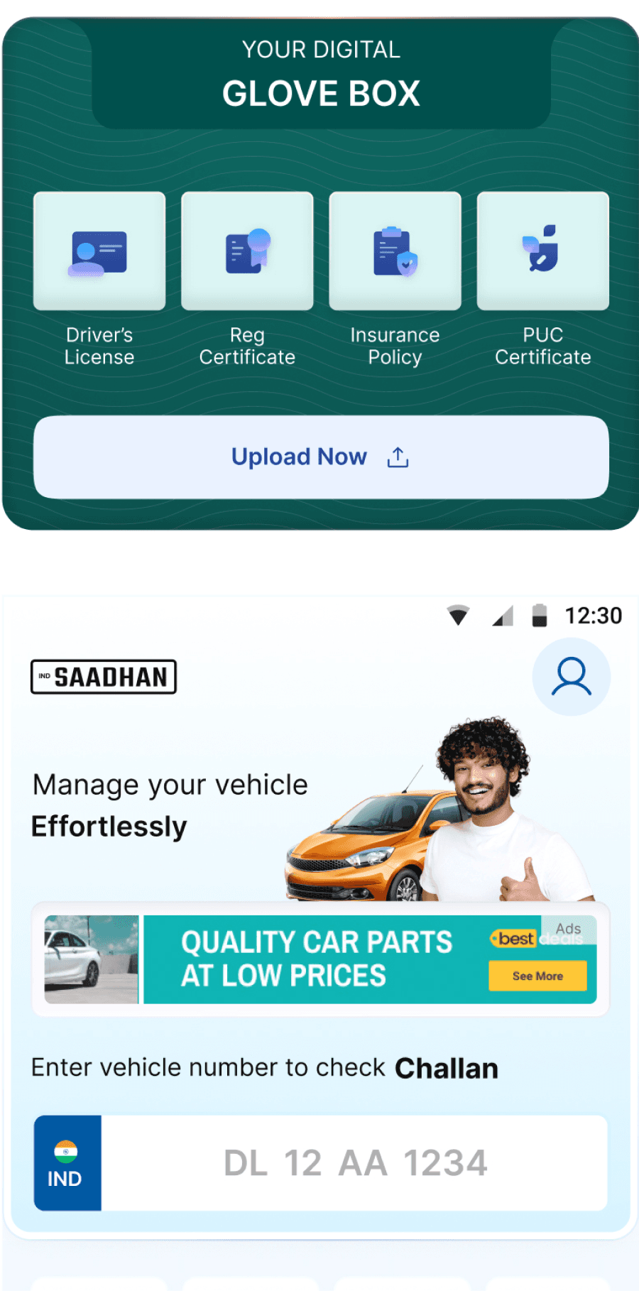
Bharat RTO APP helps users check challans, manage insurance reminders, and view real-time vehicle info like PUCC and registration status etc.
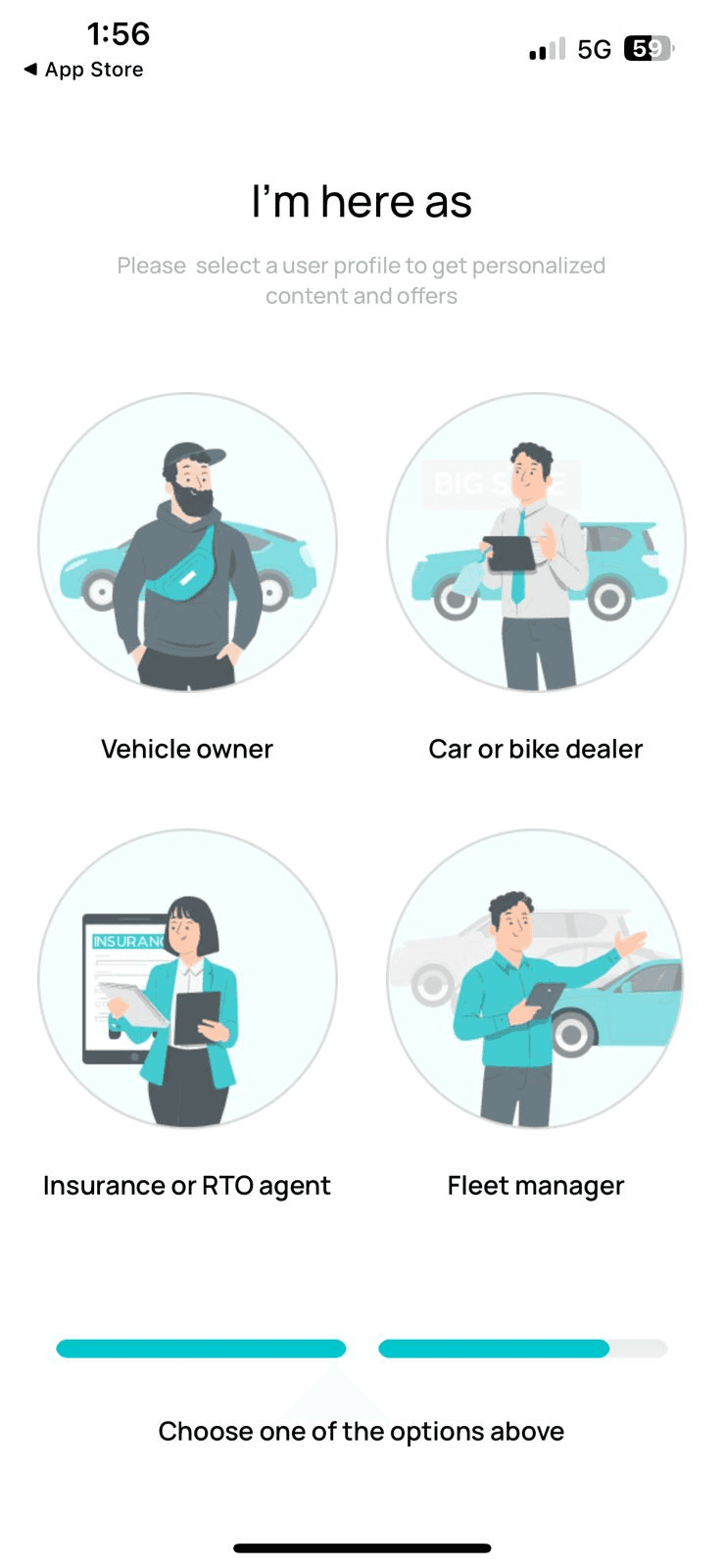
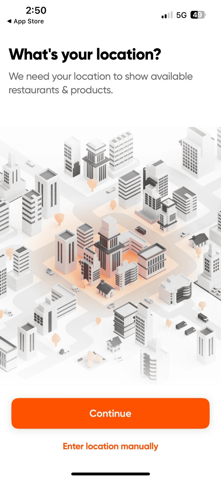
Reason for building
Bharat RTO by CARS24

Target mass vehicle owners
Tap into India’s 20 Cr+ vehicle user base.

Drive service leads to Cars24
Resale, insurance, and loan opportunities.

Monetize traffic
Ads, affiliates, and brand partnerships.


But early results were disappointing
Vehicles added per 100 users
11.3
D30 Retention
2.2%
Onboarding completion:
28%

Avg. session time
3min
So I began diagnosing
The real problem

UI/UX Audit Using Live App Data
To pinpoint where users face friction or abandon key flows, enabling focused improvements.
Competitor Analysis
To learn from the strengths and pitfalls of top apps in the same space and raise our bar.
UX Best Practices from Case Studies
To incorporate proven, user-centric design patterns that have succeeded in similar domains.
Engaging & SEO-Driven Feature Research
To ensure our most visible features match what users are actively searching for.

Some screenshots of research
Key insights
issues
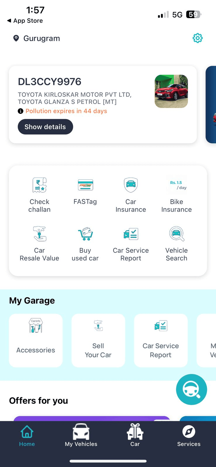
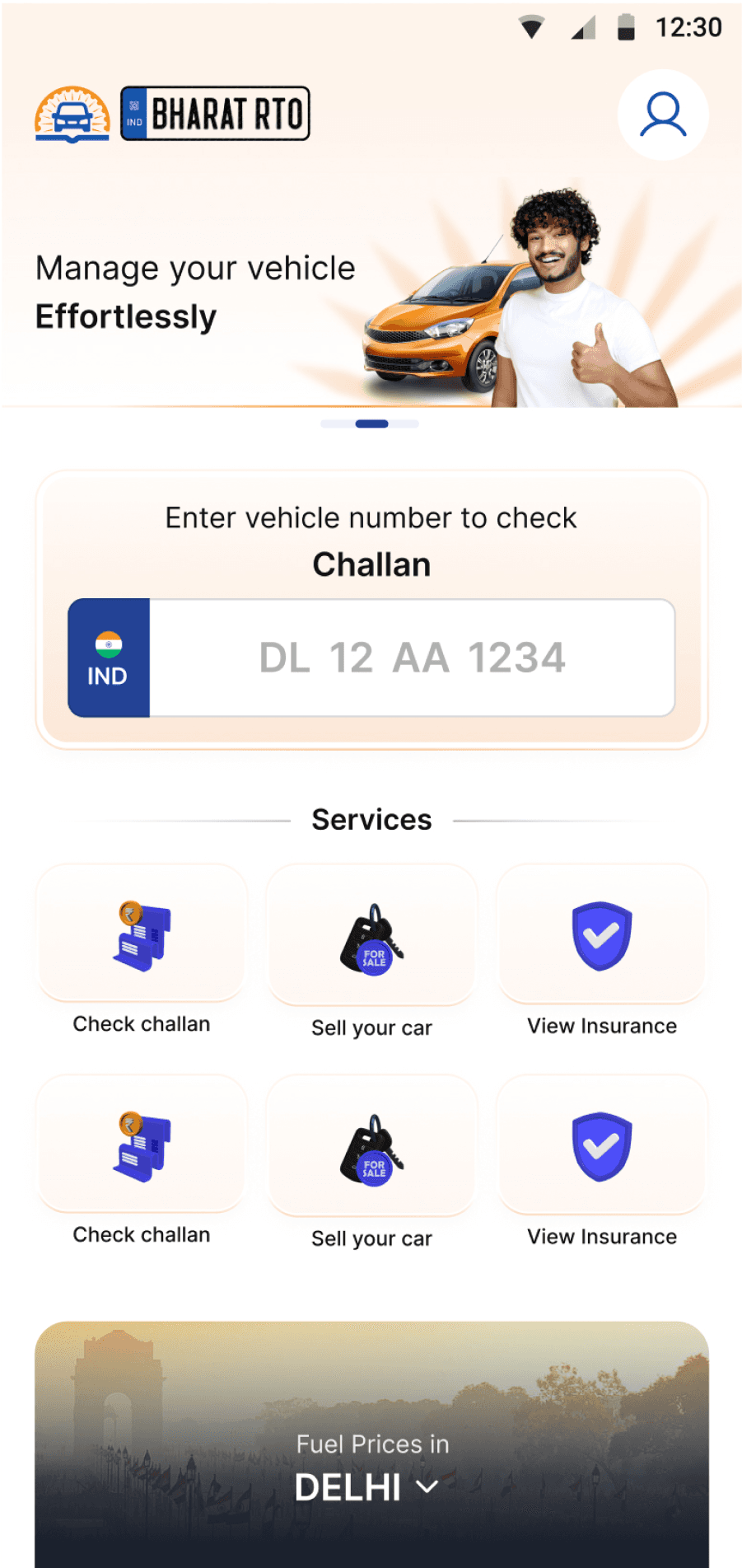
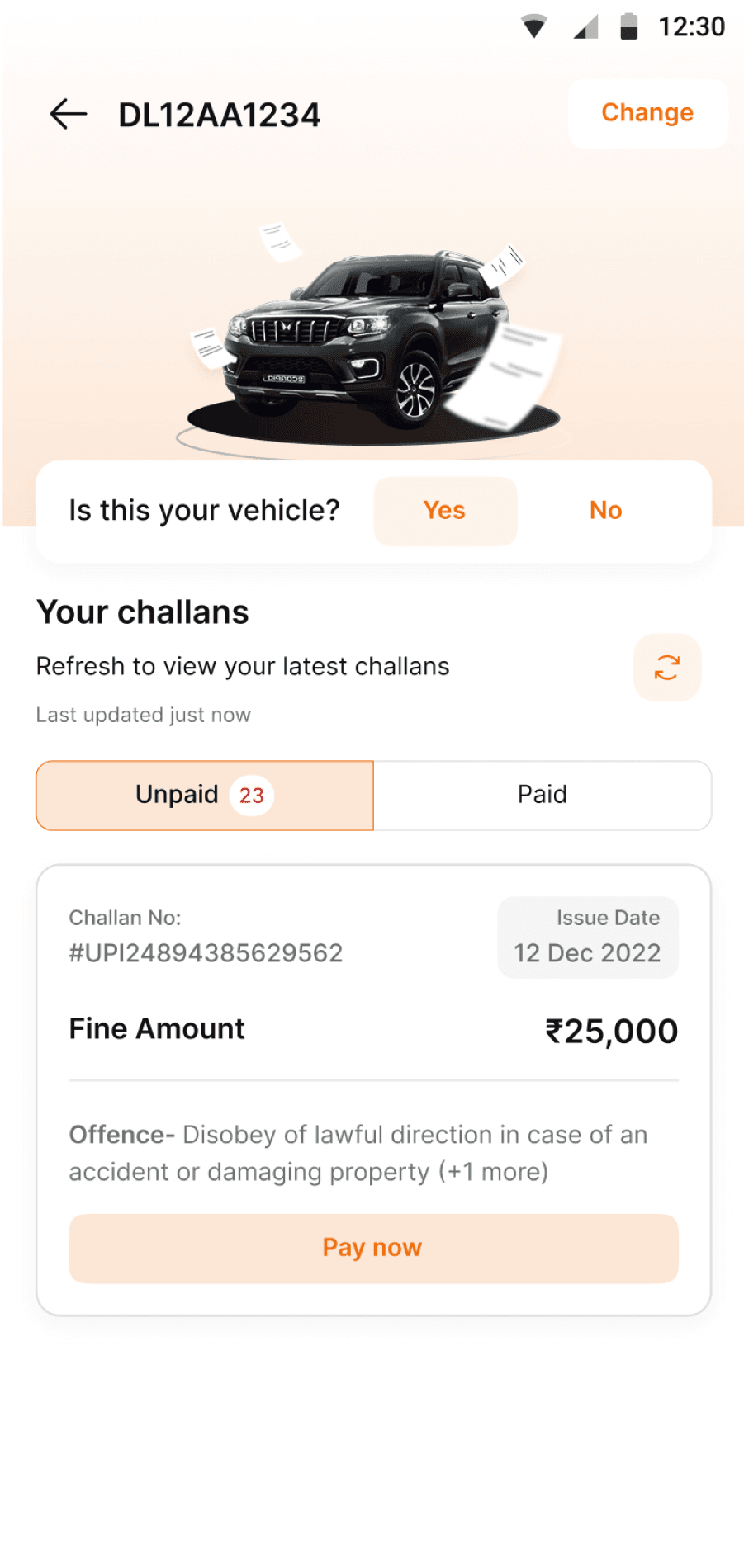
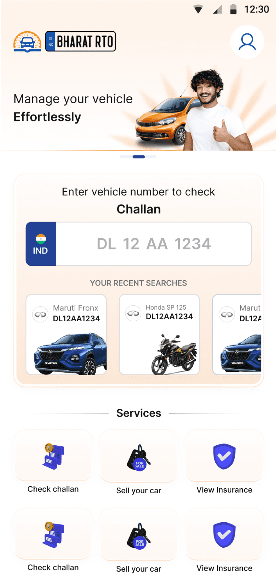
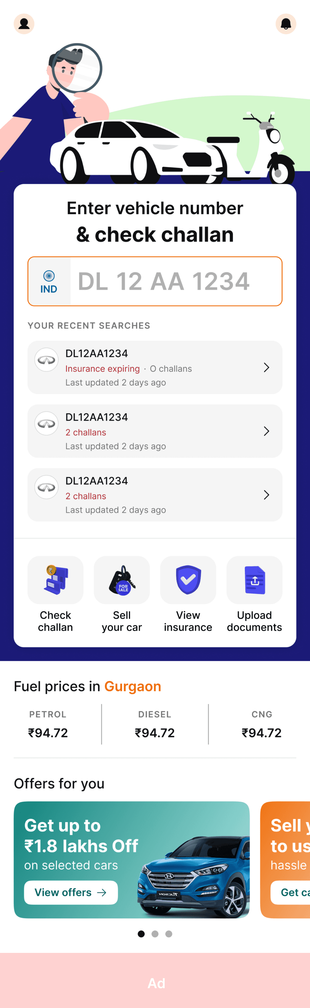
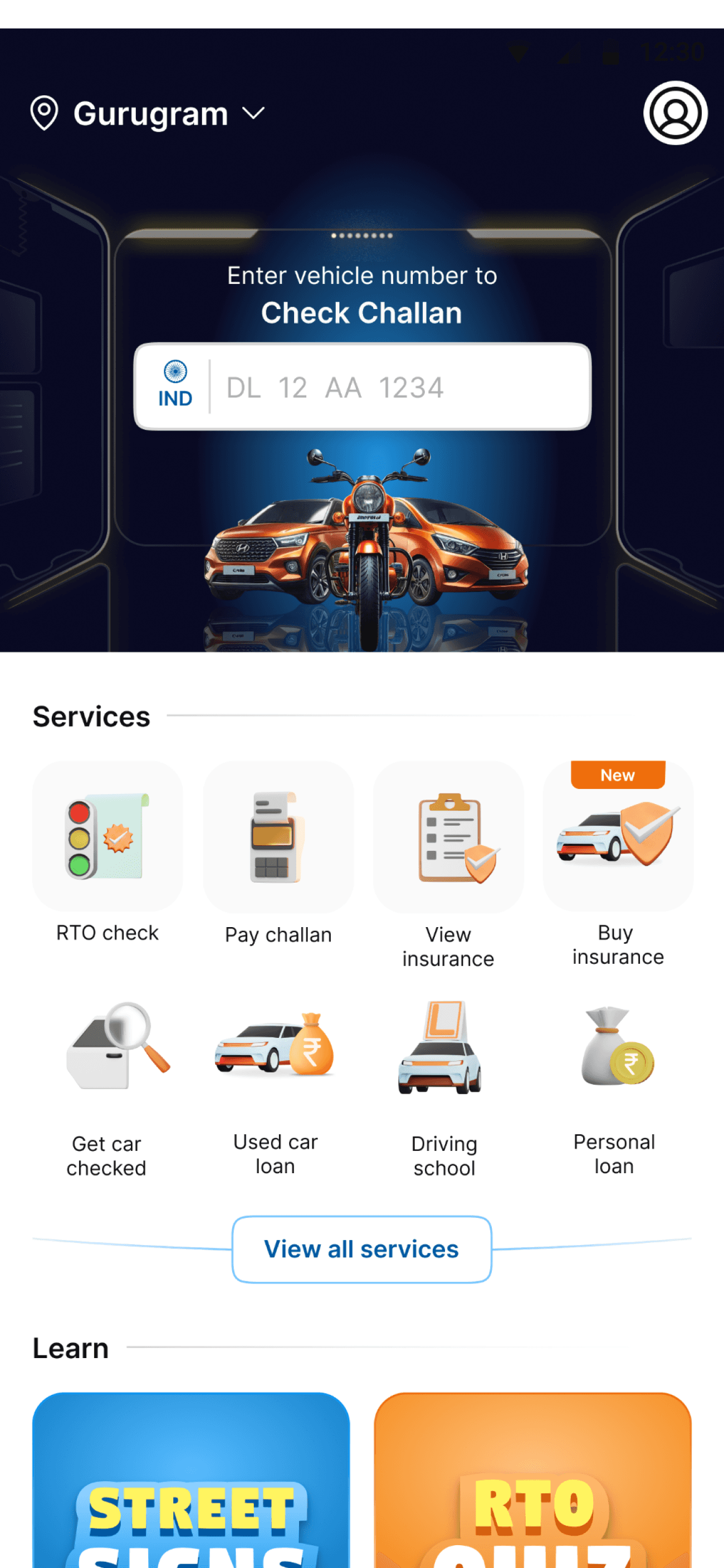
Enter vehicle number
& check challan
IND
DL
12
AA
1234
Your recent searches
DL12AA1234
Insurance expiring
·
O challans
Last updated 2 days ago
DL12AA1234
2 challans
Last updated 2 days ago
DL12AA1234
2 challans
Last updated 2 days ago

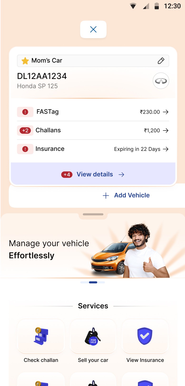
Check
challan

Sell
your car

View
insurance

Upload
documents
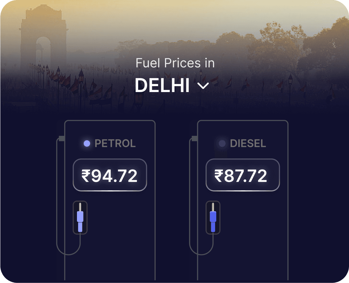
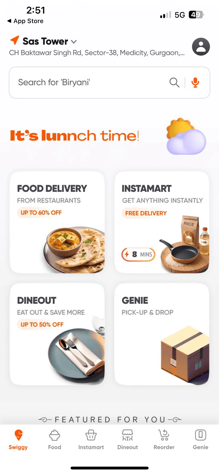
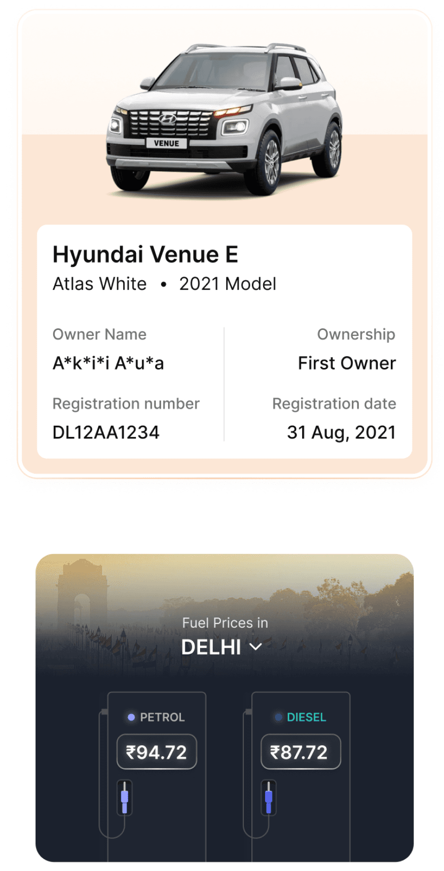
Fuel prices in Gurgaon
PETROL
₹94.72
DIESEL
₹94.72
CNG
₹94.72
Offers for you
Get up to
₹1.8 lakhs Off
on selected cars
View offers

Sell your car
to us
hassle free
Get car price
Ad
This element does not align with the direction or purpose of the buttom icon.
The number should appear in the number plate format while typing.
This area could be used for showcasing internal or external offers.
The amount of space used for displaying the vehicle information is excessive, especially since there are no additional utilities or features being shown to improve the owner's experience.
Currently, the priority for both the business and the user is not to add more vehicles, but to access other services — which are becoming hidden.
I might just check random vehicle numbers; in such user scenarios, showing the search history every time doesn't make sense.
This section has strong potential to engage users — for example, by showing historical fuel prices to encourage interaction.
These can be used as interactive cards in other parts of the app.
More icons can be included for better clarity and usability.
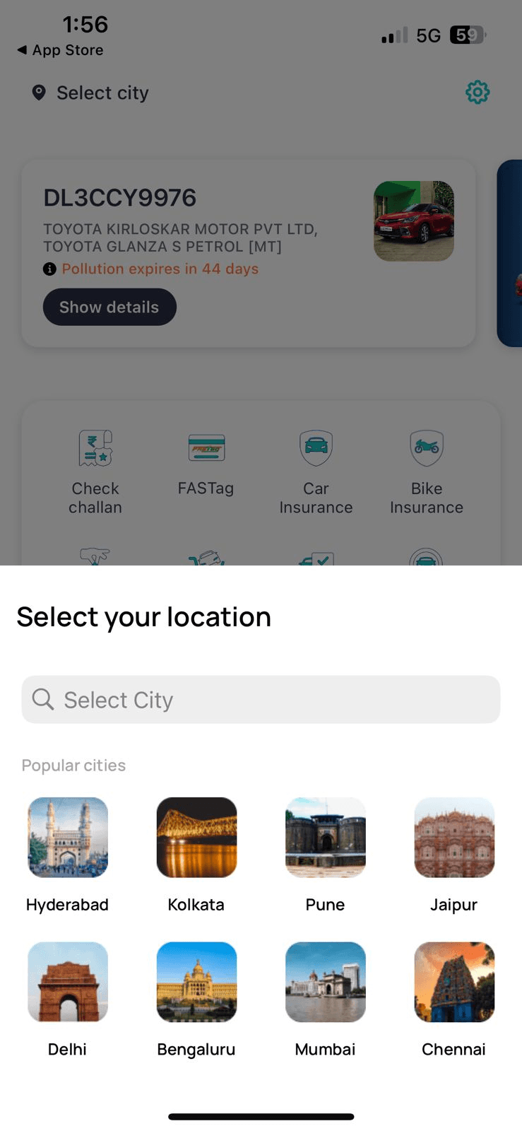
A dropdown to change location can be added and made more engaging.
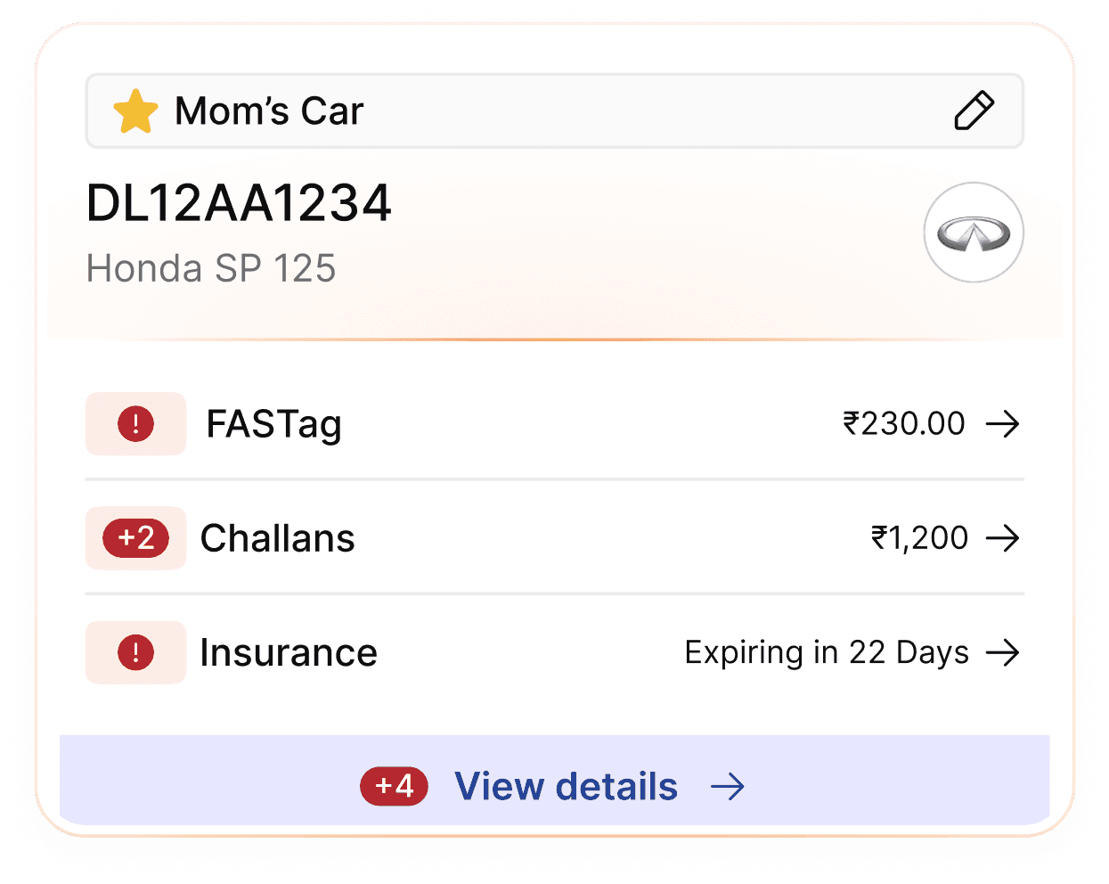
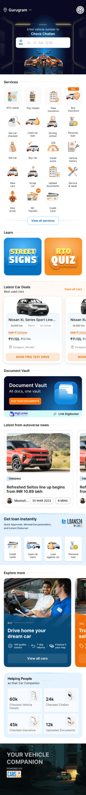
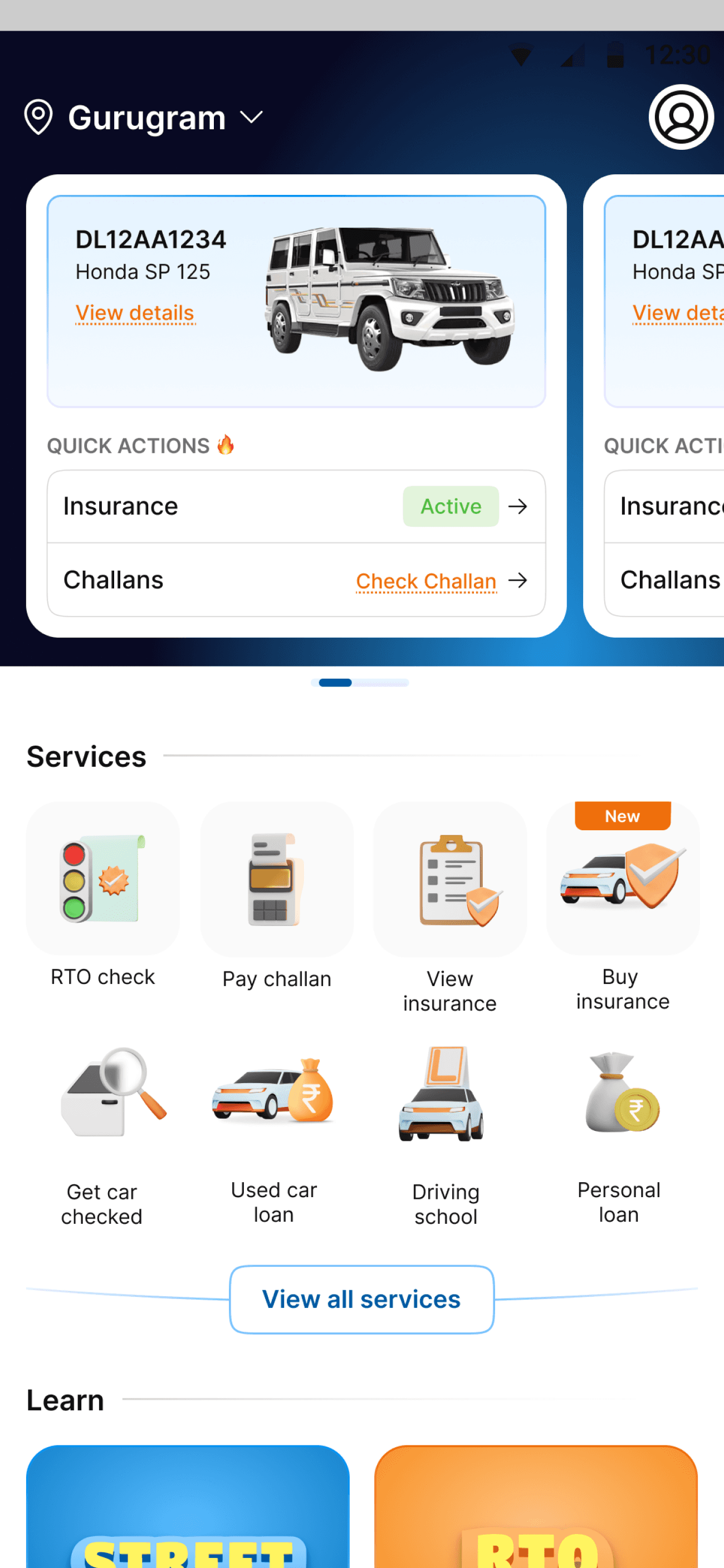
Your vehicle
DL12AA1234
Honda SP 125
Insurance expiring soon
DL12AA1234
Honda SP 125
Insurance expiring soon
View all your vehicles
Search details for another vehicle
IND
DL
12
AA
1234
Your recent searches
DL12AA1234
2 challans
Last updated 2 days ago
DL12AA1234
Insurance expiring
·
O challans
Last updated 2 days ago
DL12AA1234
O challans
Last updated 2 days ago
Explore other services
View
insurance
Sell
your car
Check
challan
Upload
documents
Fuel prices in Gurgaon
PETROL
₹94.72
DIESEL
₹94.72
CNG
₹94.72
Offers for you
Get up to
₹1.8 lakhs Off
on selected cars
View offers

Sell your car
to us
hassle free
Get car price
Ad
Check car valuation
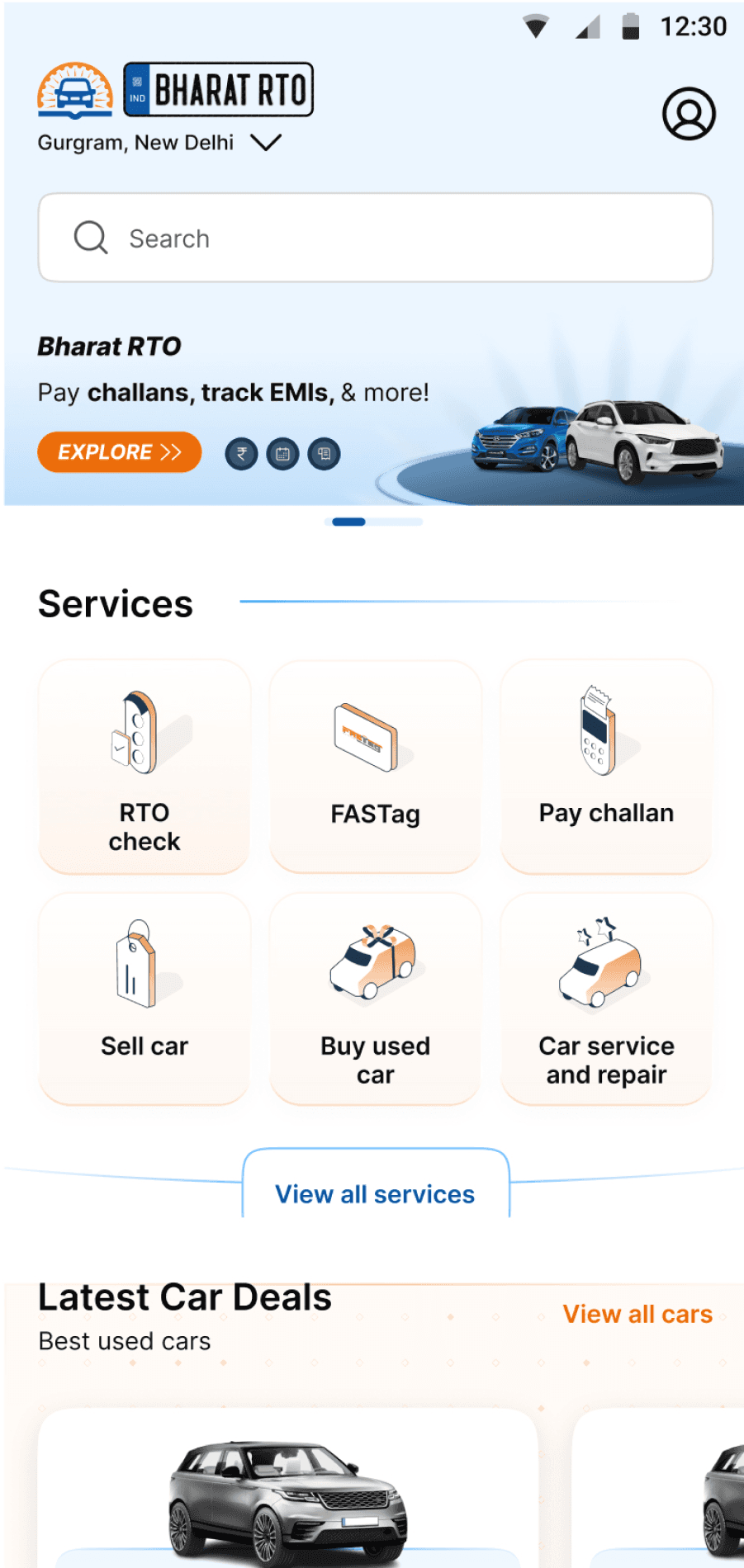
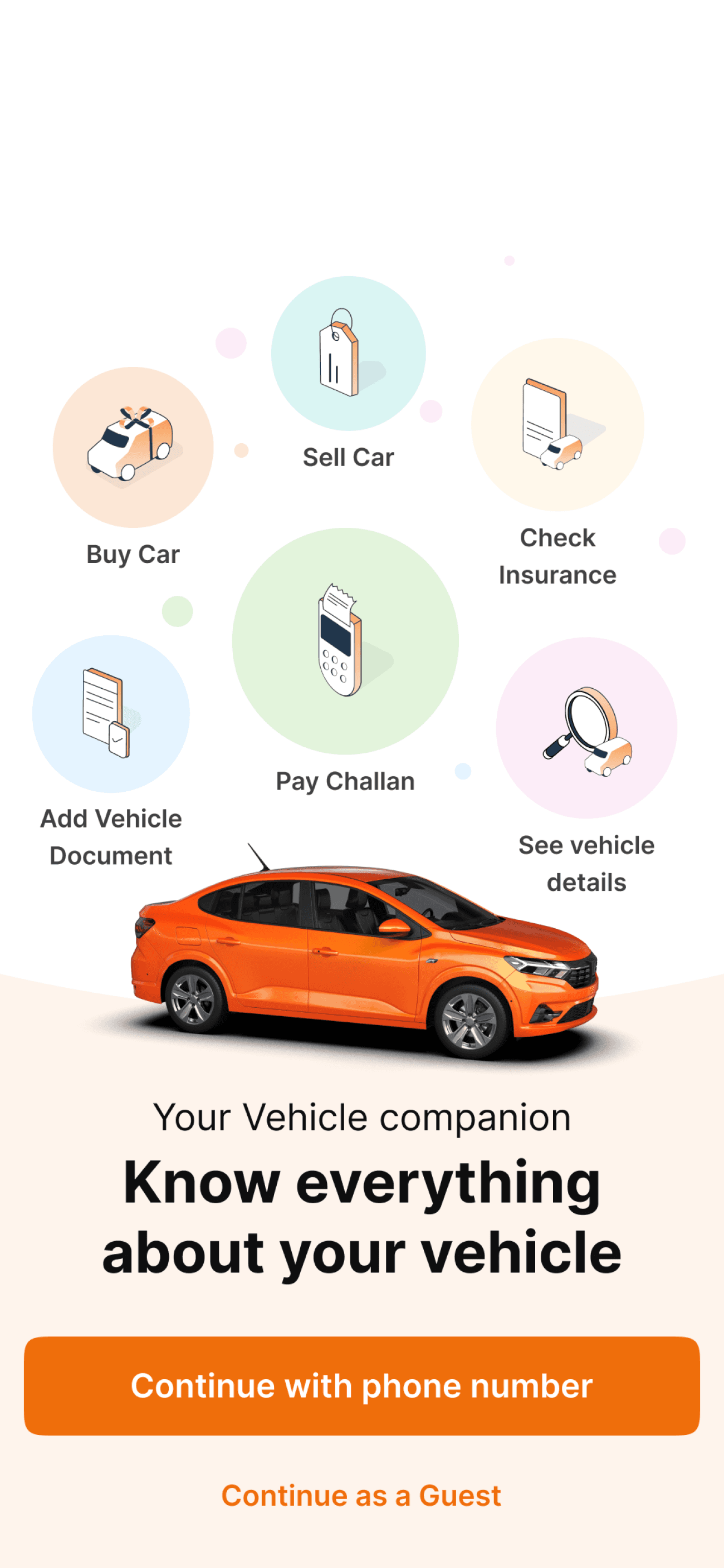
Hompage diagnose
Current Onboarding flaws
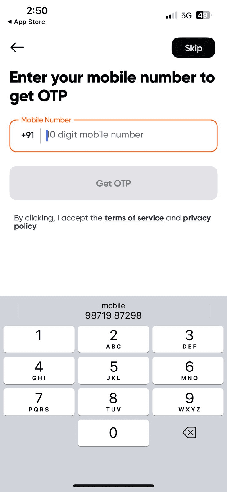
It takes 3 screens to explain what the app is about
Maximum click than any other app, total 5 clicks are required to get to the home screen
Same Content repetitive in title and body text
Less explanatory with icons
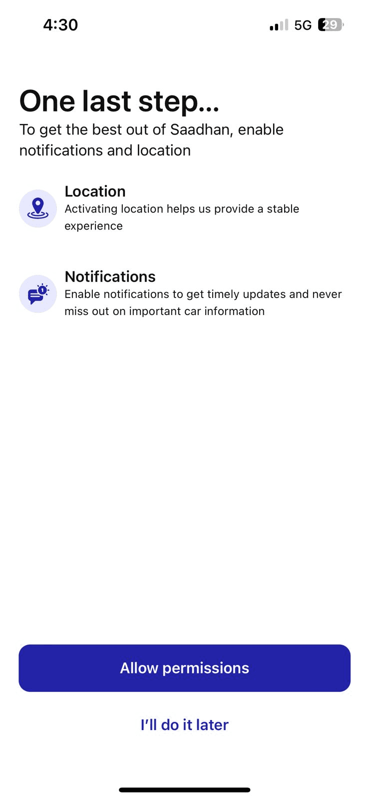
Not everyone is comfortable with notifications, and here it's like compulsory permission with location.
When I said that I’ll do it later, then why is it shown again and without an option to skip
Onboarding diagnose
Secondary research
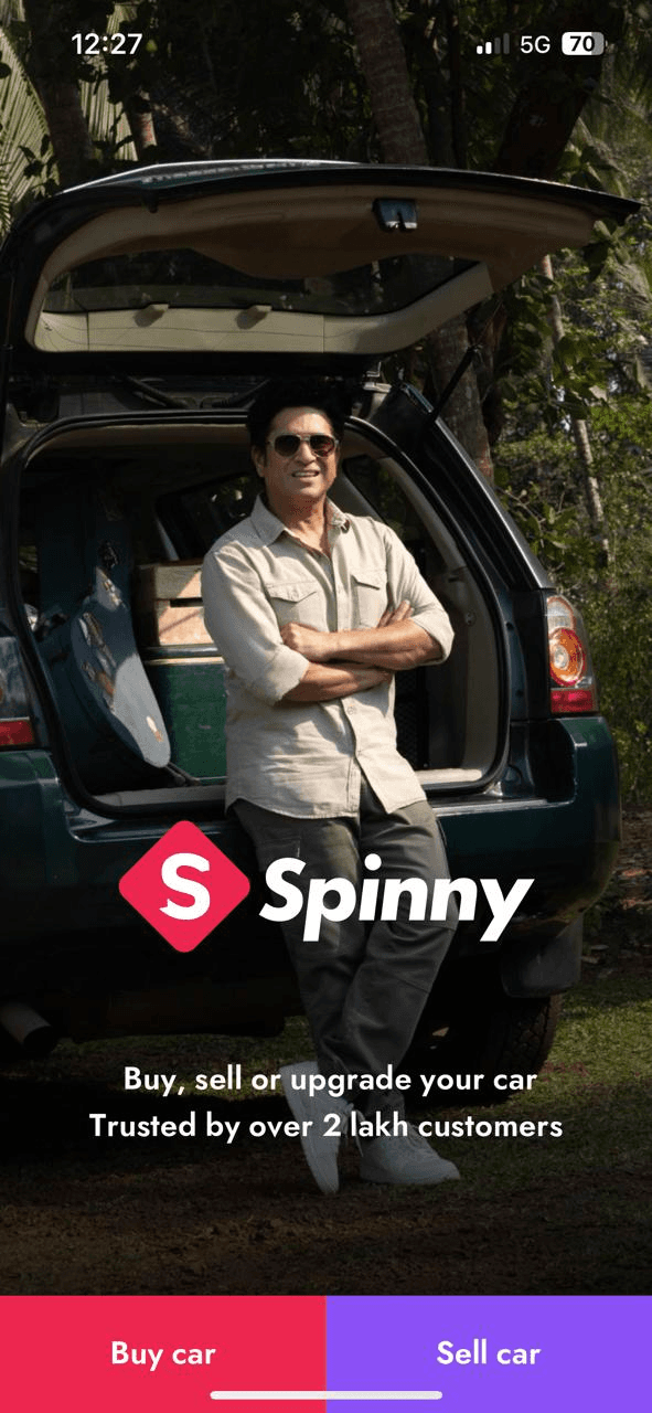
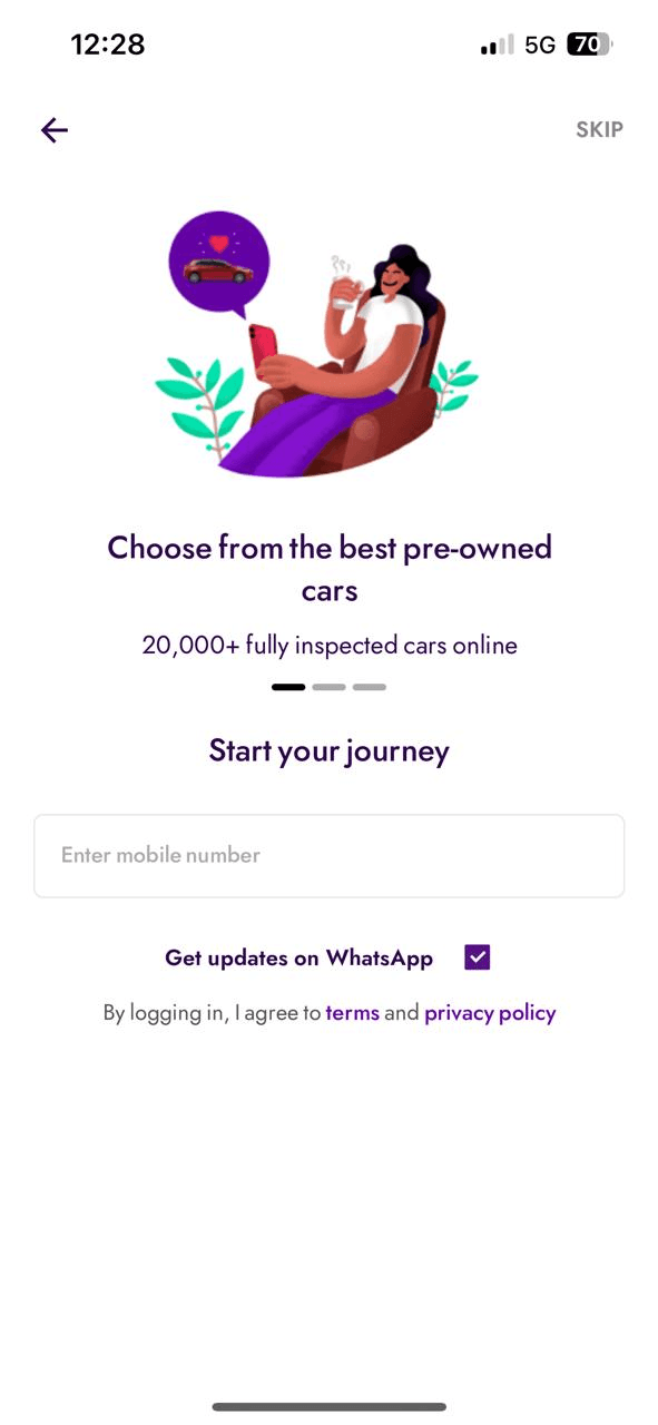
Spinny key takeaways
Taking away one click of first selecting phone and then typing, integrated it very nicely with the onboarding screens.
3 clicks to reach homepage if we do not put phone no.
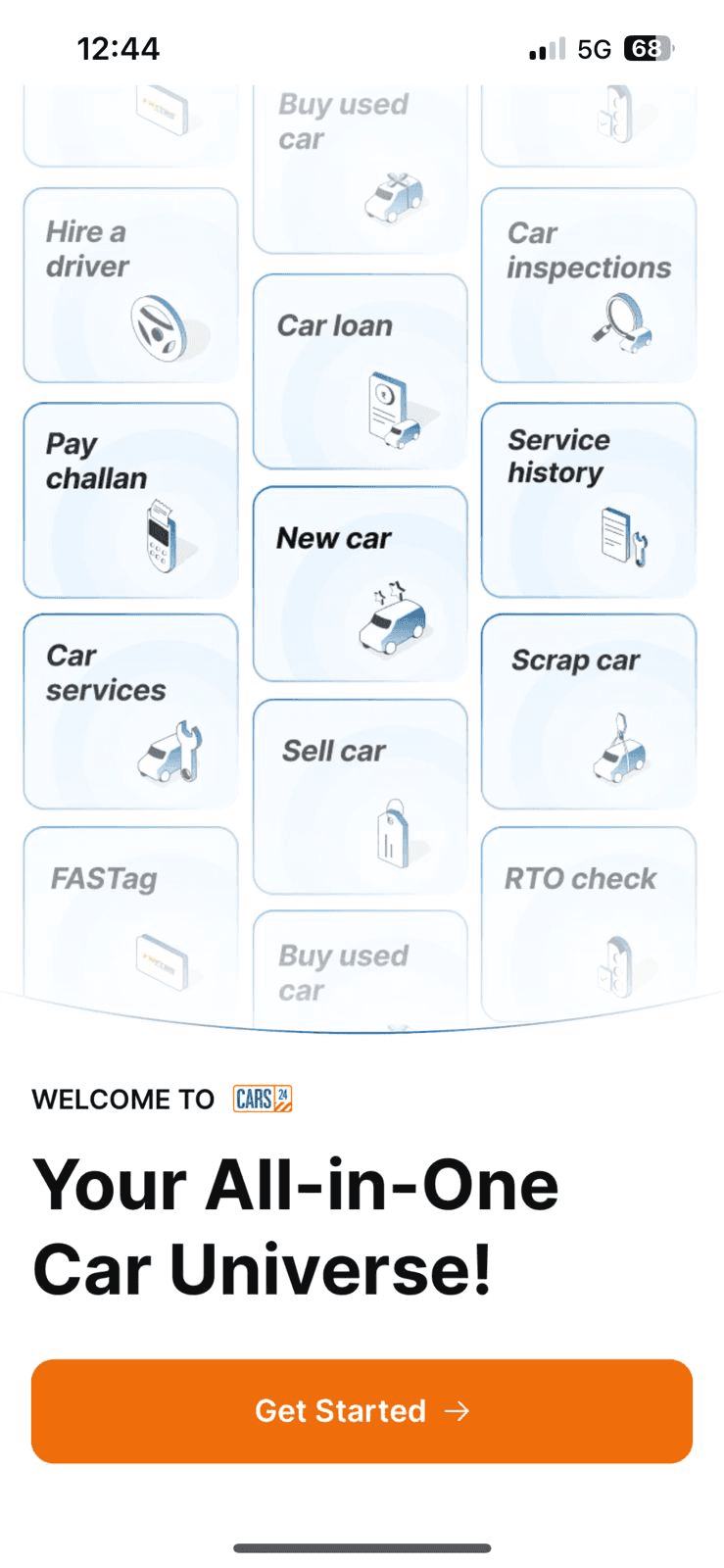
Cars24 key takeaways
Very easy to understand onboarding screen, communicating all things that you can expect from cars24 in one screen with a minimal animation to keep users engaged.
3 clicks to reach homepage if we do not put phone no.

Park+ key takeaways
Very similar to cars24, easy overview of the whole app as soon you reach the onboarding
Best part about the onboarding is it only takes 2 clicks to onboard

Carinfo key takeaways
Even Carinfo tries to showcase everything they do in a single frame.
Gathering data about the person relation with car in an interactive way.
Taking location while keeping the app in the background makes users feel that they have just reached the app, it is just one step more to go.
3 steps

Swiggy key takeaways
Slides showcased with names not with dots, so that even if the user does not see other slides, they will till be able to get an overview of the platform.
Introduction with a video makes the platform more engaging as people can relate to real life things more.


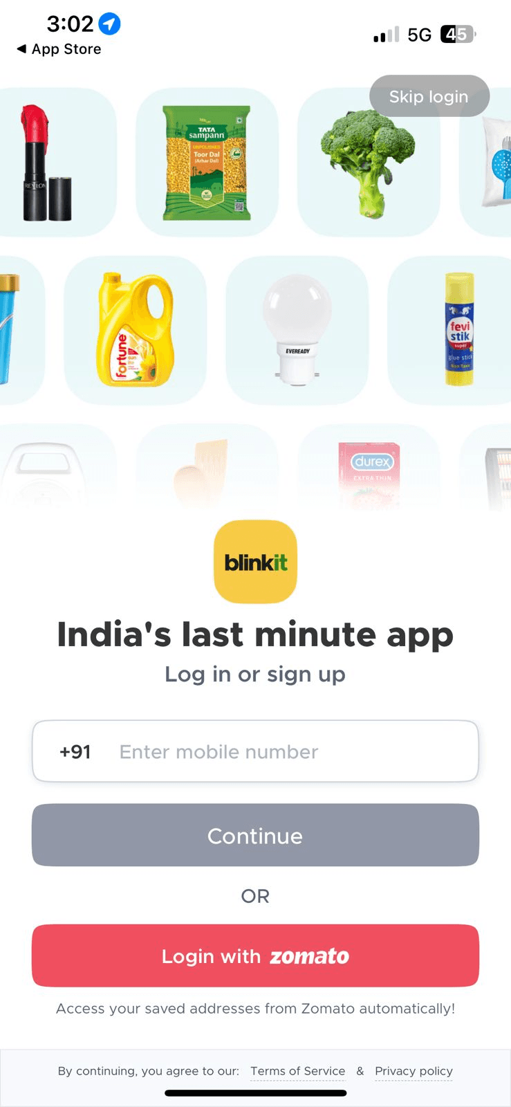
Blinkit key takeaways
Slides showcased with names not with dots, so that even if the user does not see other slides, they will till be able to get an overview of the platform.
Introduction with a video makes the platform more engaging as people can relate to real life things more.

Gomechanic key takeaways
Multiple options given to login, giving freedom of choice

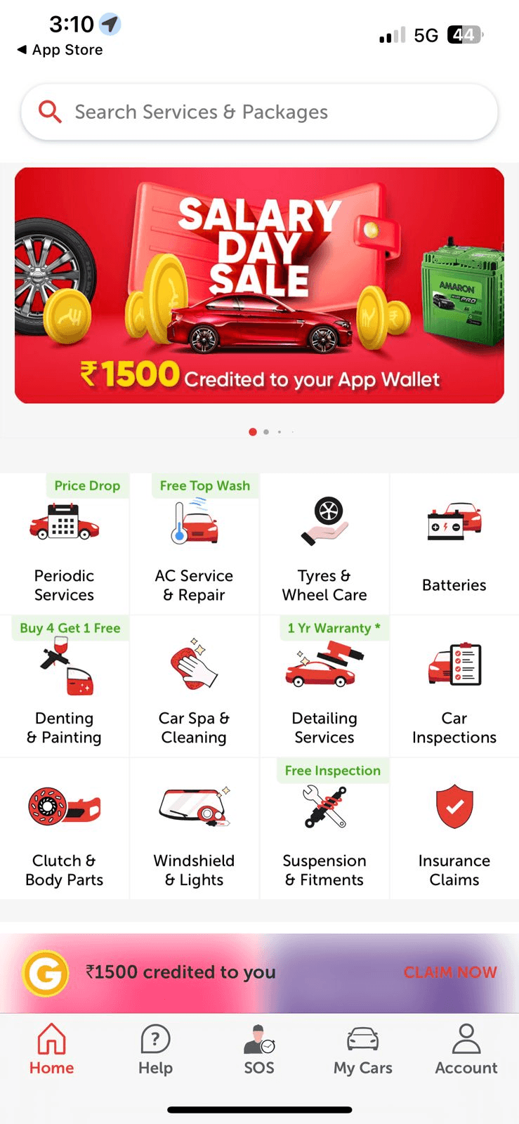
Compititors analysis
For onboarding
Cut Onboarding Steps for a Faster Start
Reduced to 3 steps because 60% drop off during long onboarding. Speeds up app access.

Show Key Info Upfront, Avoid Hidden Details
Key info upfront since 70% skip carousels and miss details. Improves engagement.

Highlight Features on One Visual Screen so Nothing’s Skipped
Single screen onboarding prevents skipping, 70% skip carousels

Collect User Data Contextually, Not During Onboarding
Users drop off 99.66% when asked questions upfront , asking later boosts engagement and reduces drop-off.
Make a Lasting First Impression with Strong Branding
Strong branding builds trust and confidence by creating a familiar and reliable user experience.
For homepage
Keep Add Vehicle Action at the Top
Placing the add-vehicle action at the top encourages early engagement, increasing user commitment and retention.
Design as a Core Vehicle Management App
Making the app feel like a dedicated vehicle management hub increases user relevance and frequency of use.

Separate & Optimize Service Tabs
Distributing services based on clicks improves navigation and engagement.

Adopt Features Validated by User & Stakeholder Testing
Including features shown engaging by user testing ensures relevance and satisfaction.

Introduce Educational Features (e.g., Street Signs Test)
Adding gamified educational features boosts return visits and engagement per secondary research.
Leverage Existing Internal Features
Reusing running features reduces cost and speeds deployment.

Alternate Info and Engaging Content
Balancing informative and engaging content prevents boredom, sustaining attention.

Improve UI for Enhanced Experience
Better UI reduces friction and boosts retention.

Prioritize Engagement to Collect Data for Growth
Focusing on multiple engagement points now enables collection of actionable data over time.
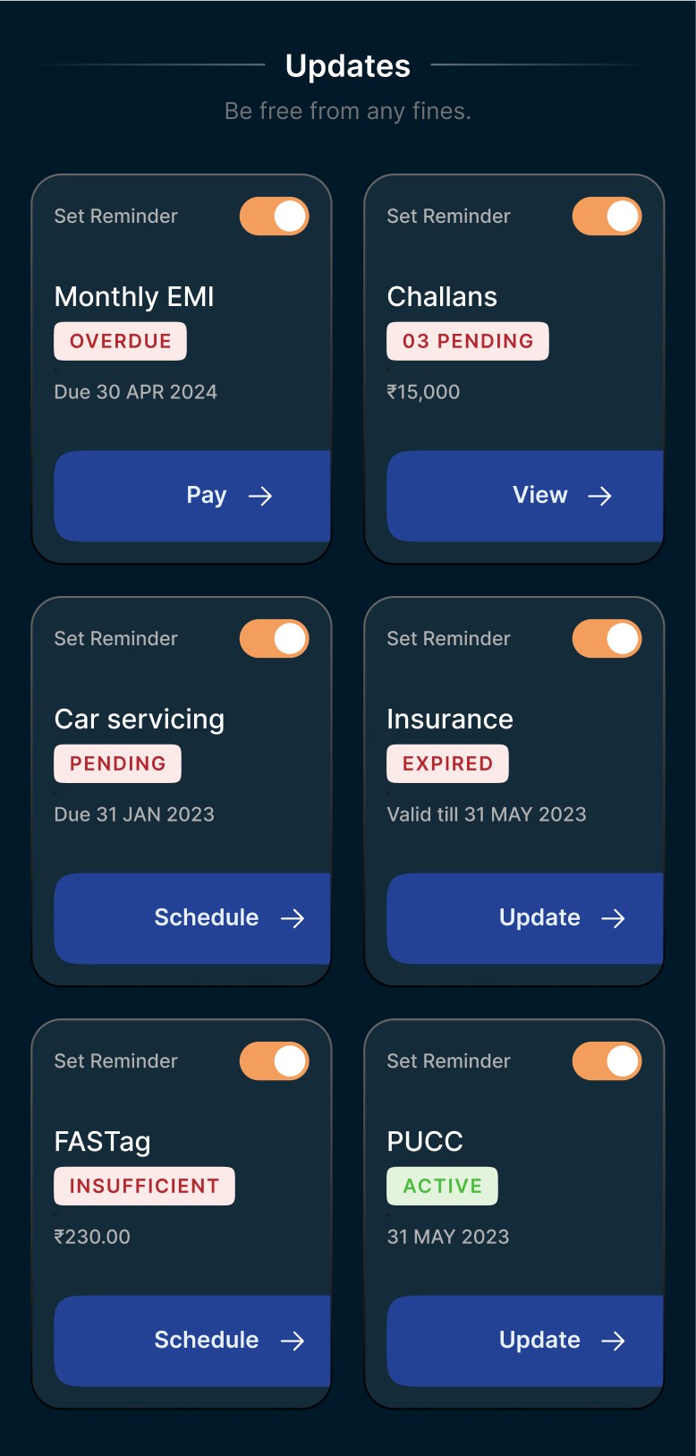
🔥 Feature
PN Section (Pending Notifications)
More Animations
Consistent Branding
RTO Exam Feature
Street Sign Learning
Bottom Navigation
Dedicated Challan Page
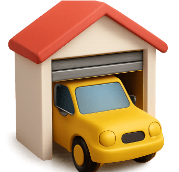
Garage Section
Easy Car Card Access
New Touchpoints for Hidden Features
Improved Communication
🧠 Why we added it
Users missed key deadlines
App felt dry/static
Design looked unbranded
Attract younger users prepping for DL
Helps learners & casual users
FAB + hamburger was confusing
Was buried earlier
Vehicle data scattered
Earlier was 3 taps away
Many tools underused
Users didn’t know what was available
❤️ User benefit
Timely alerts for challans, insurance
Engaging, delight-driven interactions
Recognizable, trustworthy app
Education + utility
Visual education, fun interaction
Direct access to core features
Centralized view of fines
Manage all cars in one place
1-tap access improves flow
Exposed via banners, nudges
Smart nudges, contextual toasts
🤩 Product/business impact
Increased opt-in to reminders
Improves brand perception
Aligns with Cars24 brand ecosystem
Drives new user acquisition
Keeps users active even after core tasks
Reduced drop-off by 20%
Monetizable surface (via payment/affiliate)
Cross-sell insurance, service, resale
Drives session depth & task success
Increases feature adoption
Educates, reduces support needs
⭐️ UX reason
Anchors habit-loop behavior
Enhances motion UX for micro-interactions
Increases top-of-mind recall
Gamified engagement adds depth
Adds depth to app use cases
Mobile UX standard best practice
High-intent action, needs priority
Identity-based ownership = retention
Aligns with user mental model
Improves discoverability, completion
Implements progressive disclosure
App requirement
according to the research
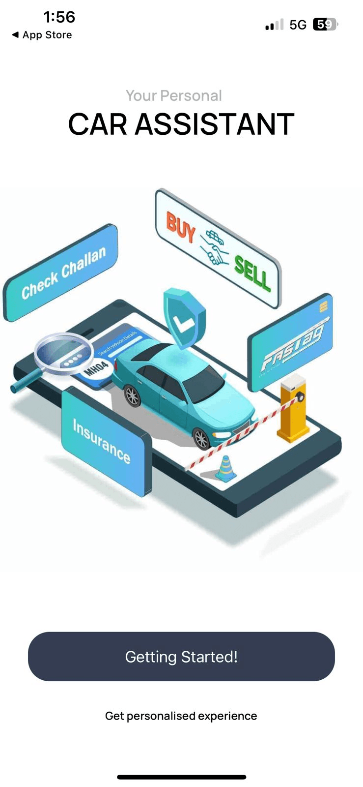
Explorations


Easy and clean onboarding
We showed half the location screen so users could see a glimpse of the homepage, applying the visibility of system status heuristic, reducing drop-offs by reassuring them the process was short, since users perceive less effort when they see they’re almost done.
Final Designs
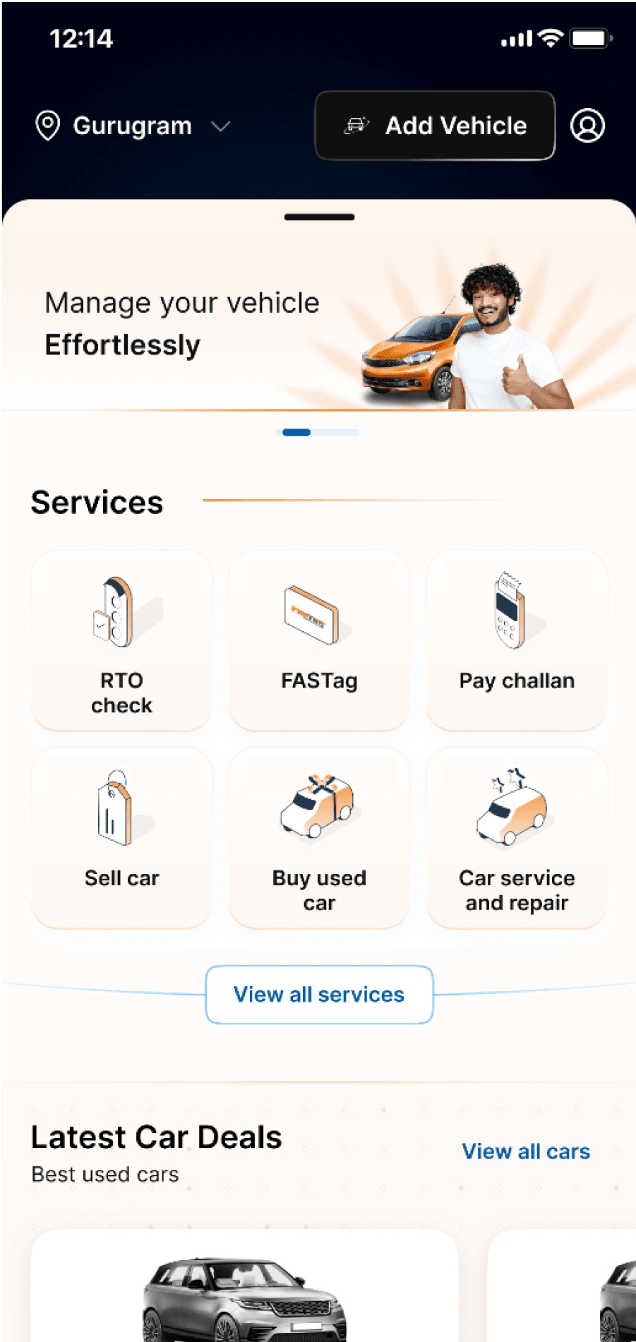
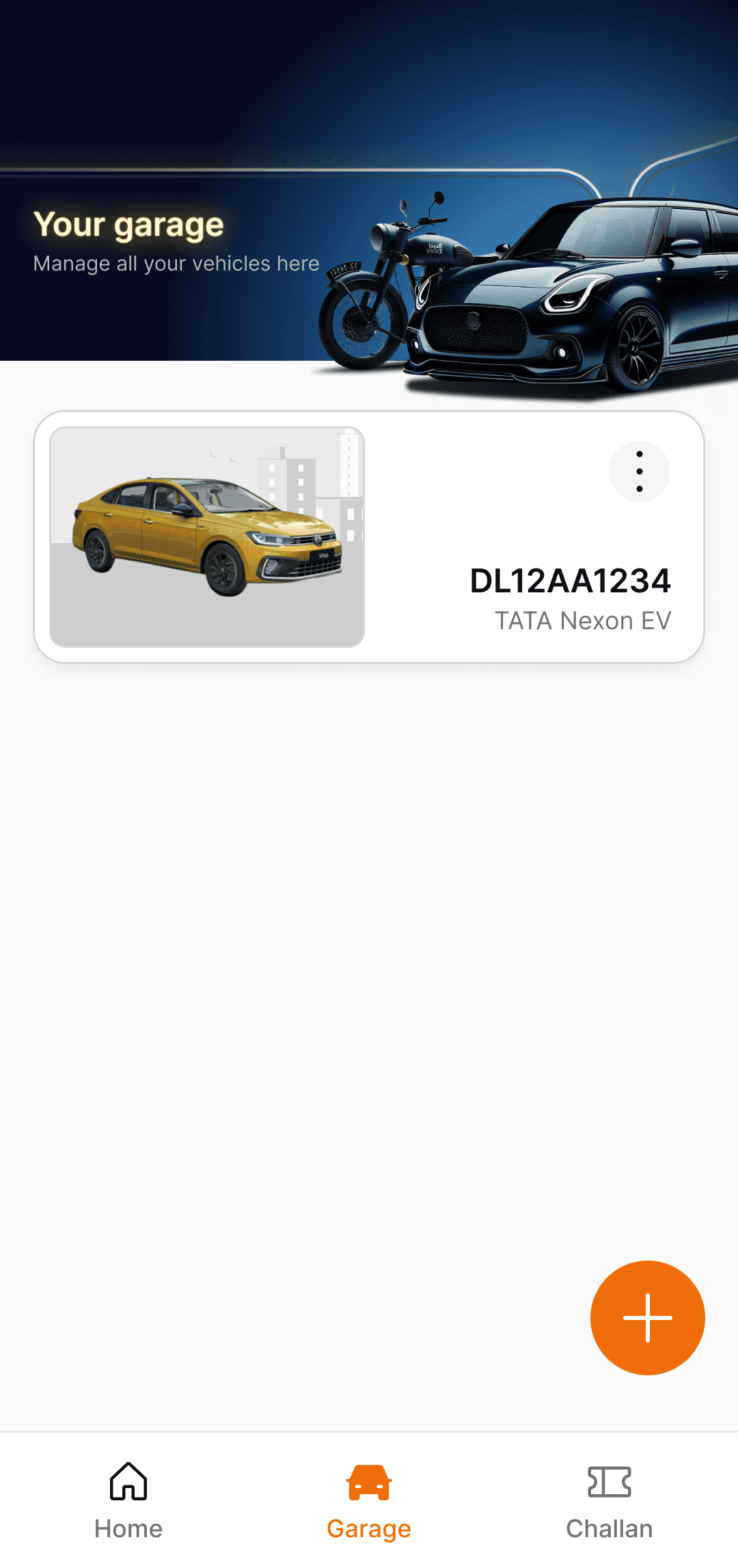
New Homepage
Full view
Carousel replaced with one static image
Image of car directly connects you with the message that it is core vehicle management app
Better content communication
Carousel replaced with one static image
Image of car directly connects you with the message that it is core vehicle management app
Better content communication
Old homepage
New homepage
Highlights
Other BU’s collaboration
Engagement
Engagement content taken from Autoverse BU
Engaging loans entry points
Second-car lead source for CARS24
Entry points for upload document
Hidden services

Top banner view after car has been added
Garage view
Impact

Based of the same number of user base
Since there was an increase in users, the metrics may appear to show higher growth. However, we want to evaluate the actual difference at the same user base level.
Data per 30k users
🔥 Metric
🚗 Vehicles Added
⏱️ Avg. Session Time
📲 D30 retention
✅ Onboarding Completion
August
10,890
2.2 mins
2.2%
23%
December
31,740
8.3 mins
3.8%
70%
% Difference
191.55%
277.27%
2.2%
204.35%
The next impact journey on this app will begin from here.
It Does Not End Here
What We Learned & What’s Next

Major interaction
RTO Check
Challan
View Insurance
Garage

Interested in
Learning how to drive
Get a car
Get car loan

They are ignoring
Carousel ads
Exploring things or readings
Static things

Frustrated at
Incomplete flows
No proper segregation of services
Looks dummy because of less animations

Thank you